The Secret to True-to-Life Photos: Why We Use a ColorChecker
When you book a session with Pixels by Emily, you’re not just getting beautiful portraits — you’re getting images with accurate, consistent, and flattering colors. One of the tools that helps us deliver that quality every time is something called the X-Rite ColorChecker.
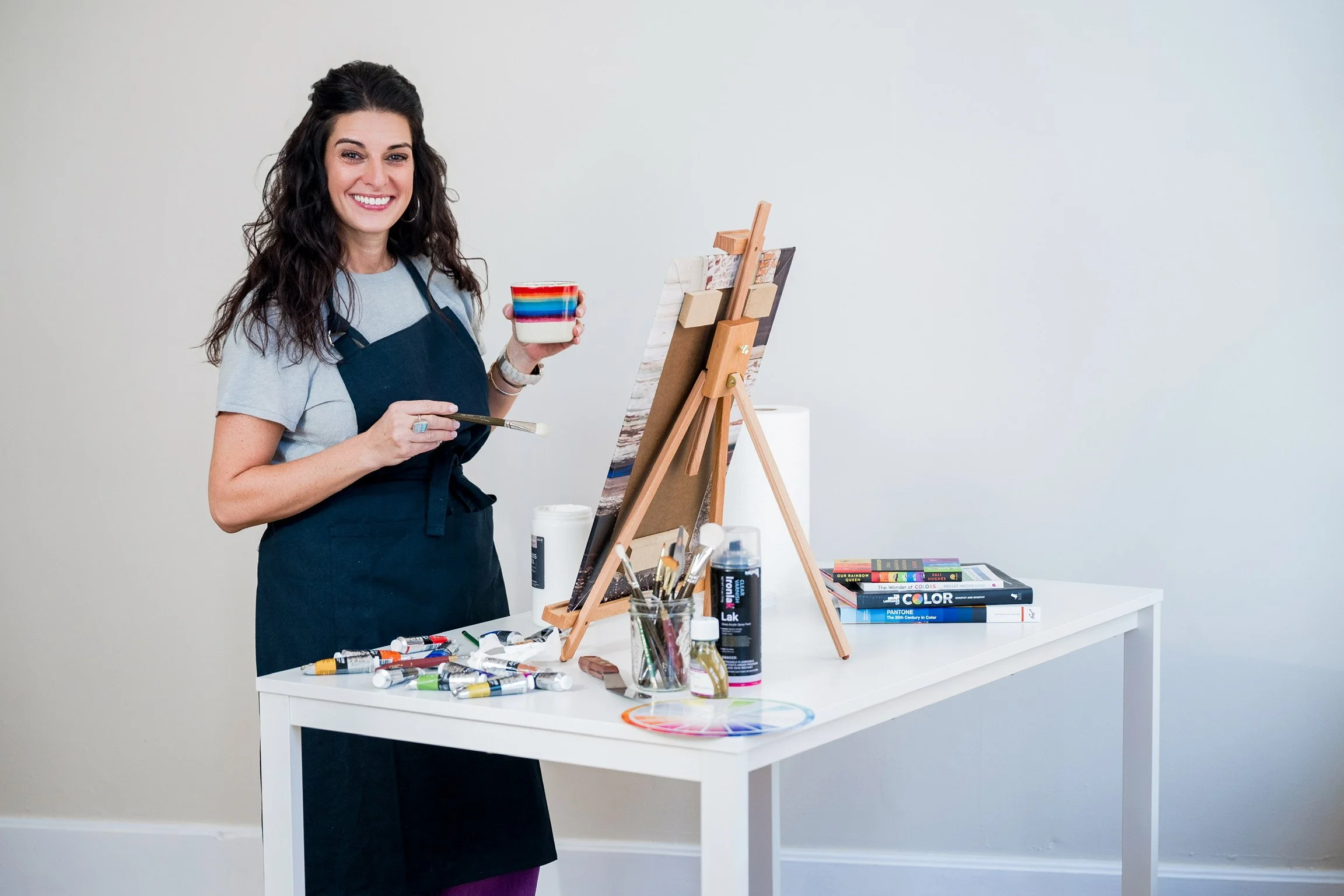
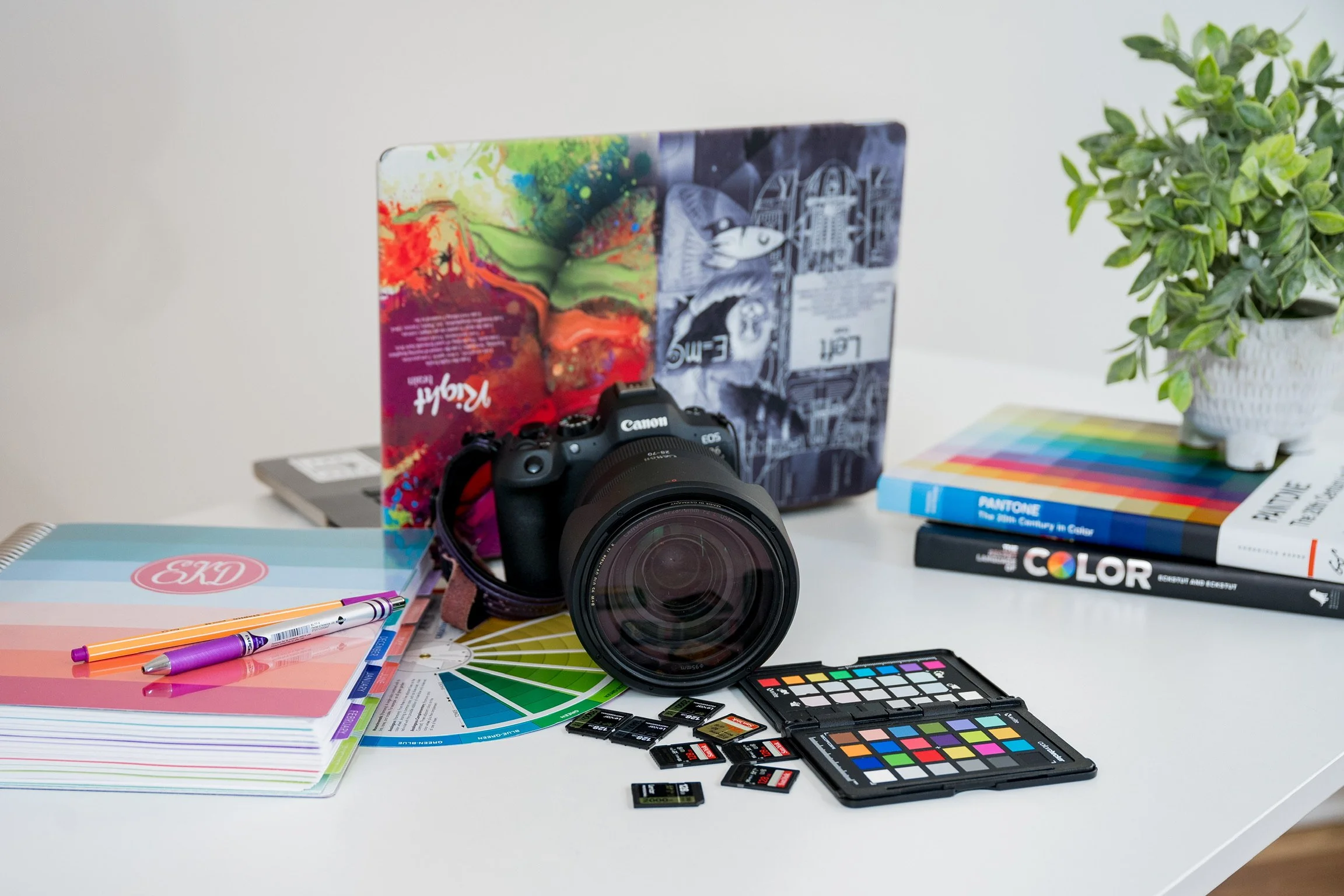
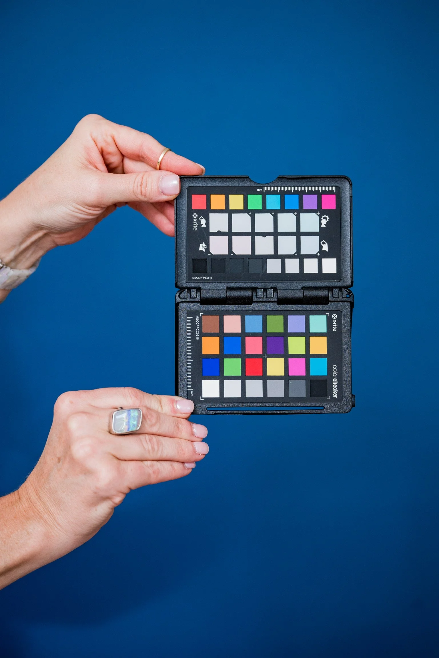
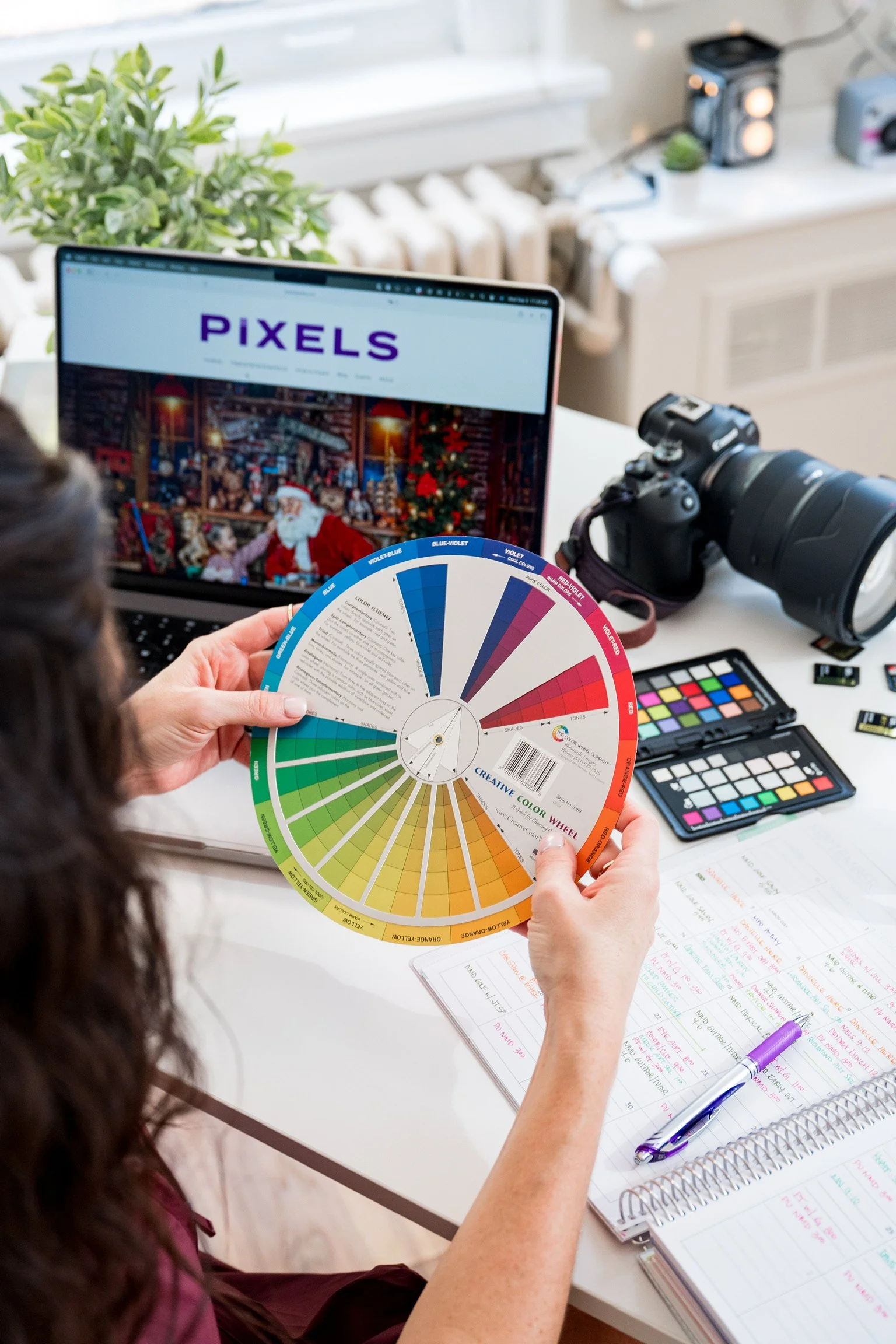
You may have seen it pop up in behind-the-scenes photos: a small fold-out card with squares of bright, bold colors and neutral grays. It might not look glamorous, but it’s a powerhouse in photography.
What is the ColorChecker?
The X-Rite ColorChecker is a professional tool designed to help photographers capture and reproduce color with precision. Each square on the card represents a known, scientifically calibrated color. By photographing it under the same lighting conditions as your session, we can later use it in editing to make sure the colors in your final images are spot-on.
Think of it as a translator between real life and your photos — ensuring your skin tone looks natural, your outfit colors stay true, and every image has consistency from one to the next.
How We Use It During Sessions
Here’s a peek into our workflow:
1. Set the White Balance
Before we dive into your portraits, we photograph a gray card (part of the ColorChecker) to set the camera’s custom white balance. This step ensures the camera isn’t fooled by indoor lighting, golden hour glow, or studio backdrops.
2. Photograph the ColorChecker
With white balance dialed in, we take a quick shot of the ColorChecker itself. Later, in editing, this becomes our “baseline” reference.
3. Editing With Accuracy
Using the ColorChecker in our editing software, we create a custom preset for your session. This ensures your skin tones are natural, your clothes look the way they do in real life, and no matter how many images you receive, the colors remain cohesive across the gallery.
Why It Matters to You
You may be wondering: why go to all this trouble? Can’t the camera just capture colors on its own?
The truth is, lighting and digital sensors don’t always see colors the way our eyes do. A navy suit might look almost black in one image, or a soft pink dress could appear washed out. For branding sessions, this becomes even more important — your business colors need to be accurate and consistent. For families and seniors, it ensures timeless, flattering images that will look right for years to come.
Simply put: it makes a HUGE difference in the final product.
Behind the Scenes of Professional Quality
Little tools like the ColorChecker may not be flashy, but they’re part of what sets professional photography apart. At Pixels by Emily, we believe you deserve images that feel polished, natural, and true-to-life. Every detail matters — from the props and poses we choose to the science-backed tools we use behind the scenes.
The result? Portraits that feel like you — just as vibrant, warm, and full of life as the moment itself.